Quiz vs. Landing Page: Which Converts Better in 2026?
Interactive Funnels in 2026: Why Quizzes Are Beating Classic Landing Pages
At IziUp, we review the statistics of hundreds of projects every day. And one pattern repeats itself again and again: companies that switch from classic landing pages to quizzes get more leads for the same amount of money. Sometimes twice as many. Sometimes five times as many.
This article explains why this happens. Without further ado, it provides figures and concrete conclusions.
What is interactive marketing and why is it needed?
Interactive marketing is when users don't just read a page, but actually do something: answer questions, move a slider, or select options. They're engaged in the process, not passively consuming content.
A quiz is the most common interactive marketing tool. It's a series of questions that culminates in the user receiving a result (product selection, cost calculation, personalized recommendation) and leaving a contact form.
It sounds simple. But behind this simplicity lies serious psychology.
Why is the conversion rate of standard contact forms declining every year?
Take a look at a typical 2020 landing page: a screen with benefits, several blocks describing the service, and a form at the end—name, phone number, “Submit a request.”
It worked in 2020. It will work much worse in 2026.
Several reasons:
Users have become more demanding. They've seen thousands of similar pages. The "leave a request" form leaves them with the same feeling: "Now they're going to call me and sell me something."
Banner blindness has spread to forms. The brain automatically ignores anything that looks formulaic. The "Name" and "Phone" fields are already formulaic.
No value before contact. The classic form provides nothing to the user before they enter their data. It's a transaction with zero value at entry.
According to several studies we analyzed while developing IziUp, the average landing page capture form conversion rate has dropped from 3-5% to 1-2% over the past three years. The market is overheated, attention is more valuable, and trust is even more valuable.
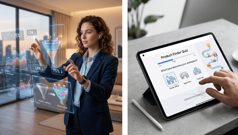
Cost per lead comparison: landing page vs. quiz
Let's talk about money. CPA (cost per acquisition) is a key metric for any marketer.
Let's provide a hypothetical, but realistic calculation based on typical cases of our clients.
Classic landing page:
- Traffic: 1000 visitors
- Form Conversion: 1.5%
- Leads: 15
- Traffic budget: $3,000
- CPA: $200
Quiz landing page:
- Traffic: 1000 visitors
- Quiz conversion: 6–8%
- Leads: 65–80
- Traffic budget: $3,000
- CPA: $375–$460
The difference is 4-5 times, with the same advertising budget.
An important caveat: the quality of leads from a quiz is often higher because the person has already completed several steps and answered questions. They're warm and fuzzy, giving the sales manager something to build on in the conversation.
User Psychology: How Gamification and Microconversions Maintain Attention
This is the main magic of the quiz.
When someone clicks "Start Test," they've already taken a small step. This is the first microconversion . Then they answer the first question—the second microconversion. The third question—the third.
Every step creates a psychological effect of engagement: "I've already done this much, I'm not going to give up." This is called the unfinished action effect (or Zeigarnik effect). The brain wants to see it through to the end.
Plus, the principle of reciprocity works: a quiz provides something valuable—a result, a calculation, a recommendation. The user feels that in exchange for contact, they are receiving real benefit, not just being added to a database.
Another point is the feeling of personalization . The feedback form is the same for everyone. The quiz adapts to the answers. Even if there are only three possible results, the user feels like it's theirs.
All of these mechanics together create what's called gamification —not in the sense of "adding badges and points," but in the sense of creating an engaging experience where every step has meaning.
3 Key Rules for a Conversion Quiz
We created hundreds of quizzes and made many mistakes before formulating these rules. They're simple, but they're violated more often than we'd like.
Rule 1: The value of the result must be clear before it begins
The user should understand what they'll get in the end before they even click "Start." Not "take a test," but "find out the exact cost of renovating your apartment in 2 minutes."
Concreteness always beats abstraction. The clearer the promise, the better the starting point.
Rule 2: No more than 5-7 questions
Every unnecessary question is a point where the user might abandon the task. A 15-question quiz isn't really a quiz, it's a survey. Nobody likes surveys.
The optimal number for most niches is 4–6 questions. This is enough to segment the user and personalize the results. And it's short enough to avoid getting boring.
Rule 3: The contact field is the last step, not an intermediate one.
A common mistake: asking for a phone number or email address mid-quiz. This destroys trust and the feeling of "I'm working toward a result."
Contact is only taken at the end, when the user has already received the value or is one step away from it. Then it's an exchange, not extortion.
Bottom line: a quiz isn't a trend, it's a different mechanic.
A classic landing page is built on the logic of "persuade them, and they'll apply." A quiz works differently: "engage them, provide value, and they'll want to continue."
In 2026, when attention is more valuable than traffic and trust is built more slowly than before, this is a fundamental difference. Interactive marketing through quizzes isn't about pretty buttons. It's about making the user feel like a human being, not just a lead in a funnel.
That's why we built IziUp as a tool for creating such funnels: quickly, without a developer, with analytics at every step.
If you haven't tried a quiz for your project yet, now is the time.
The IziUp Team